Mediterranean Flame
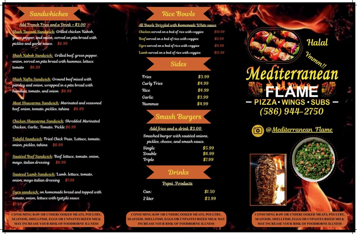
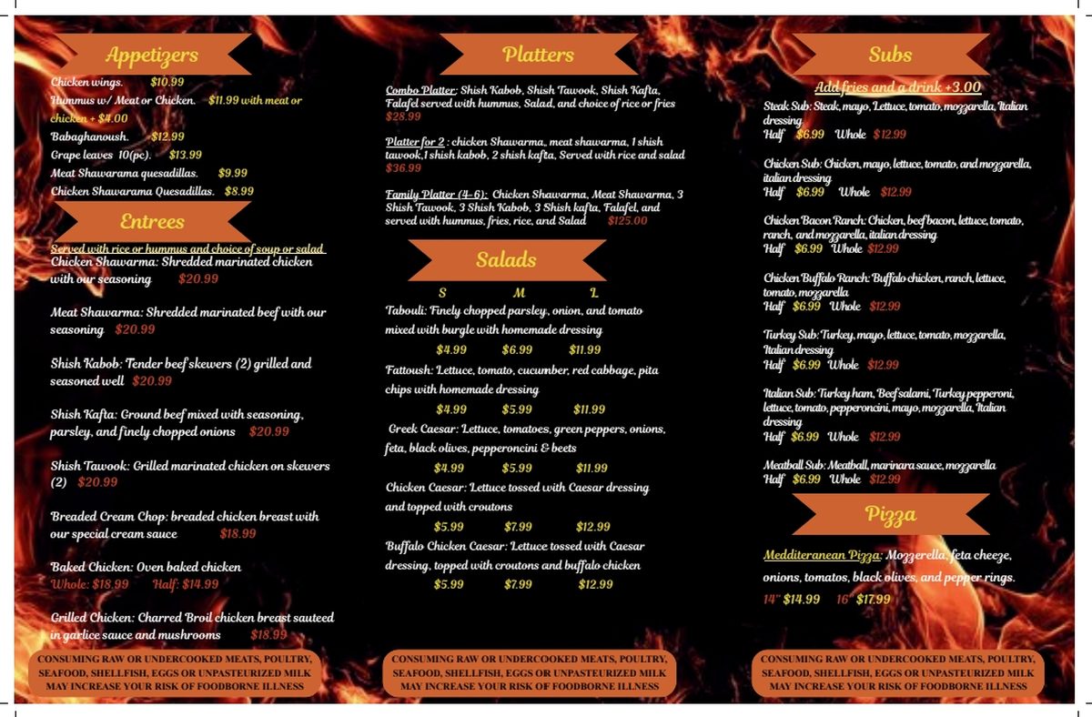
Every tile below is a complete, working version of your new website, each in a different look. Open one and scroll it: the hero, the full menu with prices, food photos, hours and map, reviews, and answers to common questions are all built in. The last section is the image library they draw from. Pick the look that feels most like your place.
The sites
Same food, same info, the same real menu and prices in every one. What changes is the feel. Open a few and see which one fits.
A canvas fire erupts, then fades into a slow-panning food photo with a shimmering headline. The one with real motion.
Your signature cue: a black chalkboard with the headline written on, stroke by stroke, in white chalk. Menu reads like the daily board. Warm and neighborhood.
Bright and fast. Announcement bar, "Order now" everywhere, ★ most-ordered badges, and a sticky order bar that follows you down the page. Built to convert.
Oversized brutalist type on near-black, a scrolling flame marquee, and a punchy photo grid. Energetic and unmissable — reads like a food-truck poster.
Earthy palette, big serif headline, and a numbered story — halal always, off the flame, the neighborhood table. Warm, premium, and personal.
A digital menu board with tabbed categories (Wraps / Platters / Bowls) next to a featured-special card. Menu-forward and instantly scannable.
A full-screen, slow-crossfading food hero — the food does the selling. Below, a masonry gallery with prices. For a brand that lets the photography lead.
Sleek dark-mode with a warm glow and gentle embers rising behind the headline. Glowing cards lift on hover. Modern fast-casual, done tastefully.
Rounded type, chunky shadow buttons, tilted sticker badges (100% Halal, Open till 10) and a scrolling marquee. Fun, friendly and very Instagram-native.
A clean split screen: brand and CTA on the left, a rotating food panel on the right. Hairline grid, technical labels, numbered menu. Disciplined and confident.
Clean, warm and easy to trust. Hero, quick info, menu, and real reviews. The one that just works on every phone.
A drifting grid of food photos fills the screen behind one card that says pick a plate. The food does the talking.
A deep-red panel cuts across a grill photo on a hard diagonal. High-contrast and bold, all about the plate.
The menu scrolls past in outlined type, top and bottom, with the headline centered between. Type-driven and full of energy.
The assets
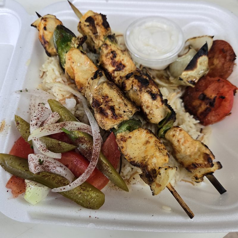
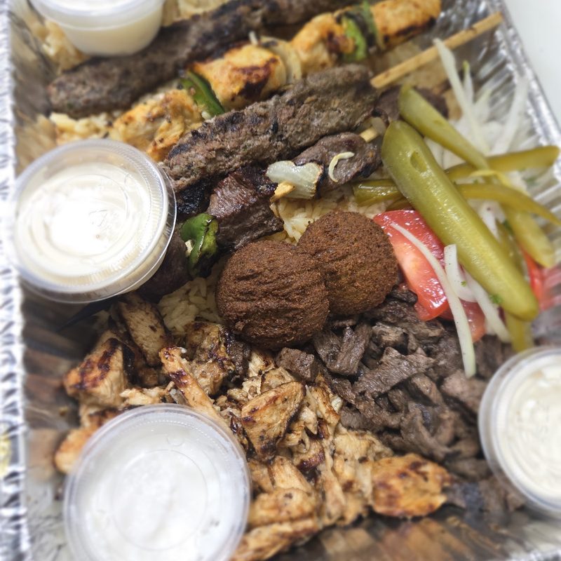
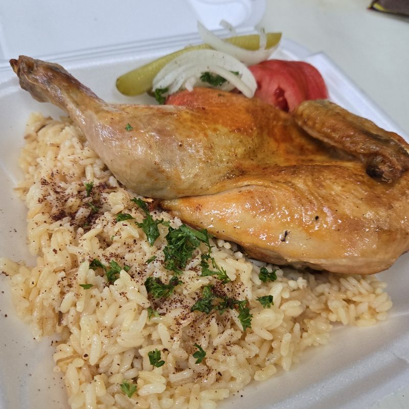
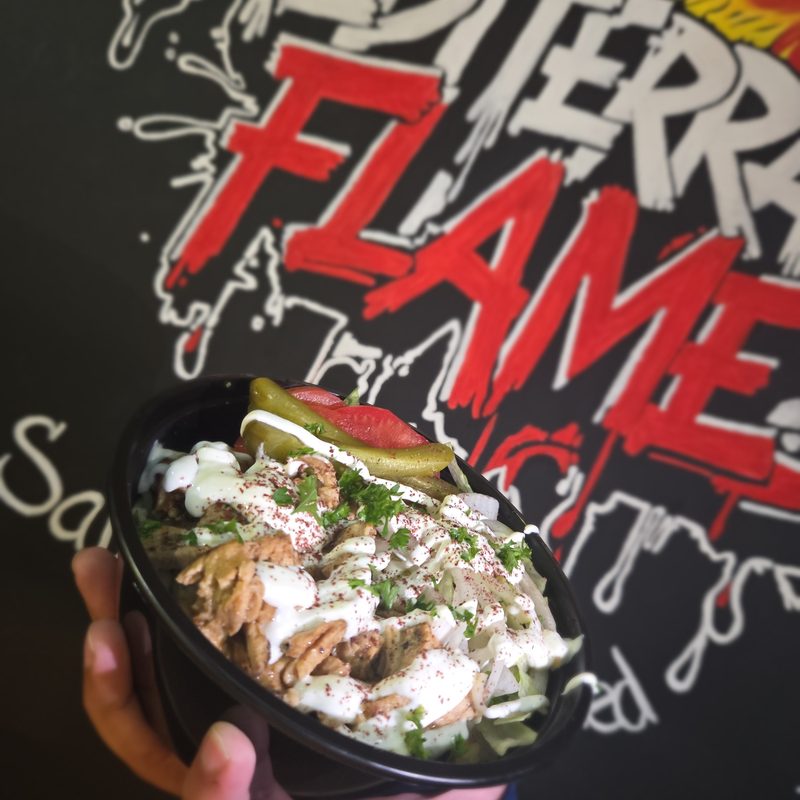
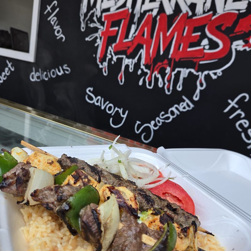
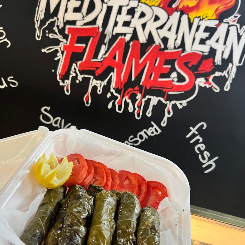
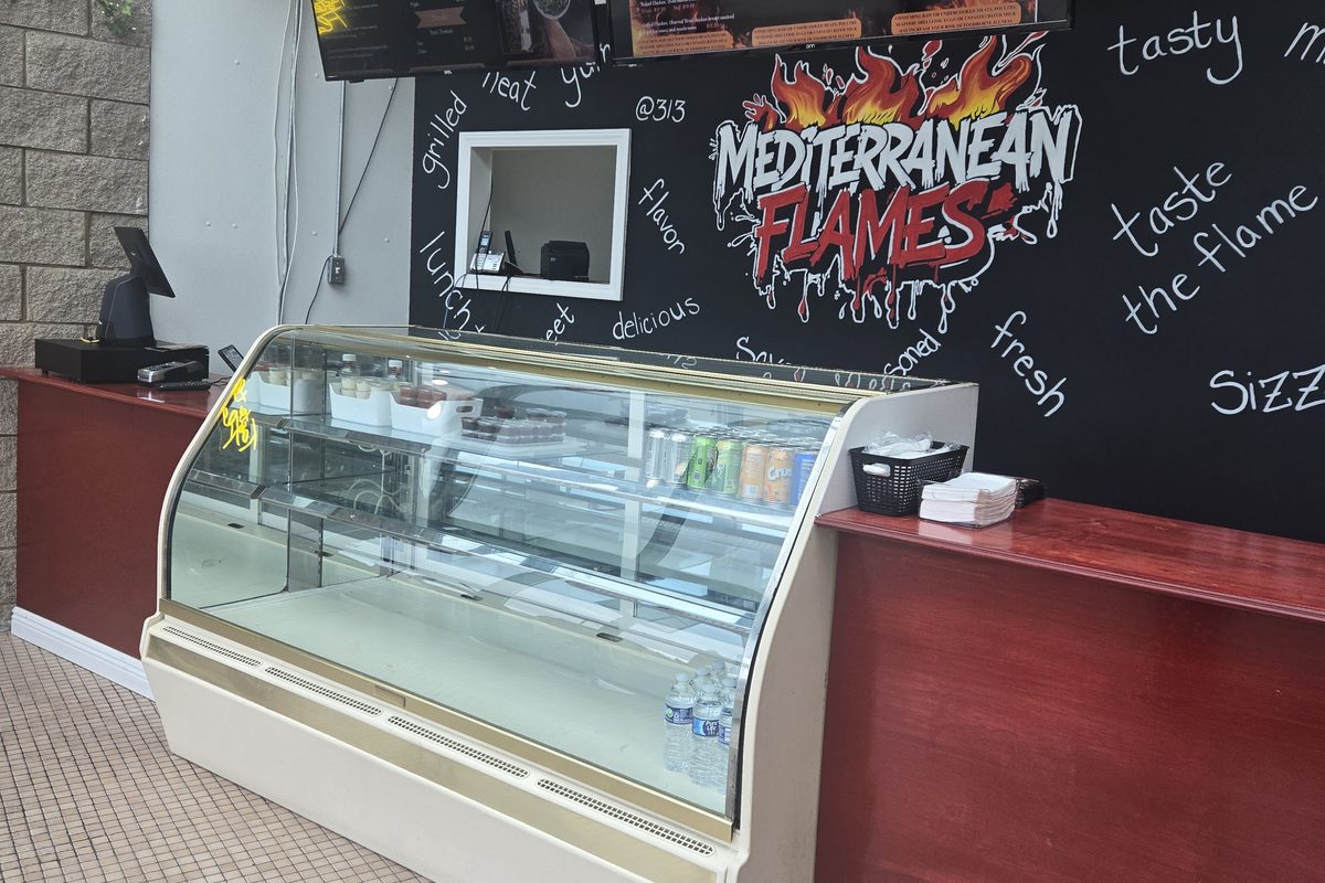
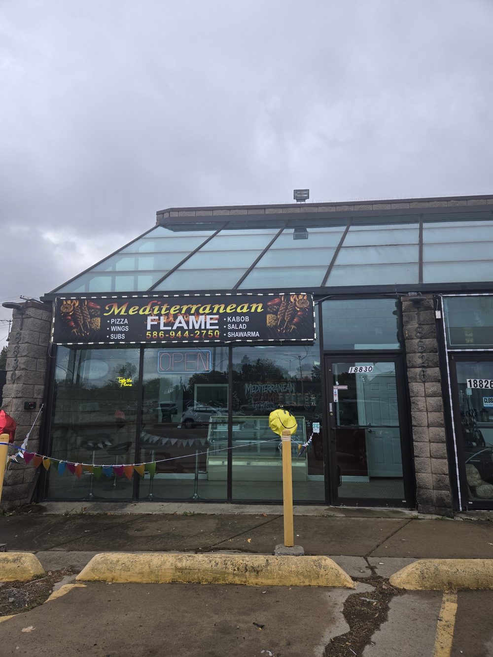
Logo, food photos, storefront, exterior and the two menu boards. Every image the sites use, in one place.